Visualizations
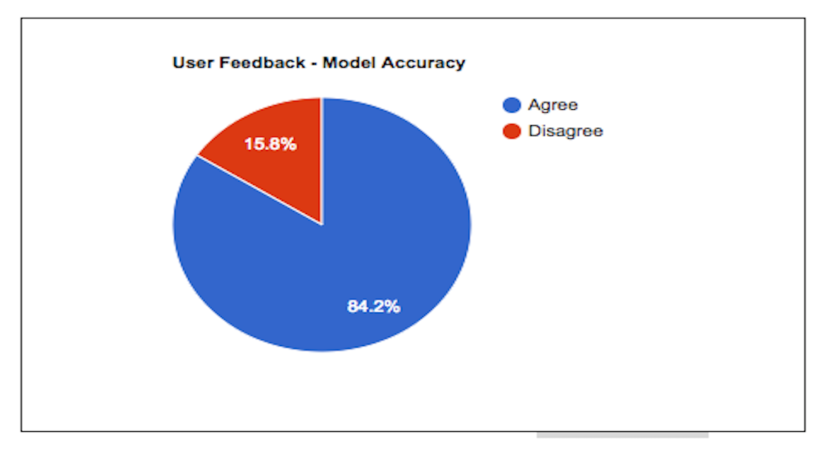
Estimated Accuracy
Displays an approximation for classification accuracy based on users who submitted articles and provided feedback
on the results page. The feedback consisted of completing a one question questionnaire asking if they agreed with
the classification. Results are displayed in a table and as a pie chart.
This visualization is dynamic and will update over time as feedback is received.
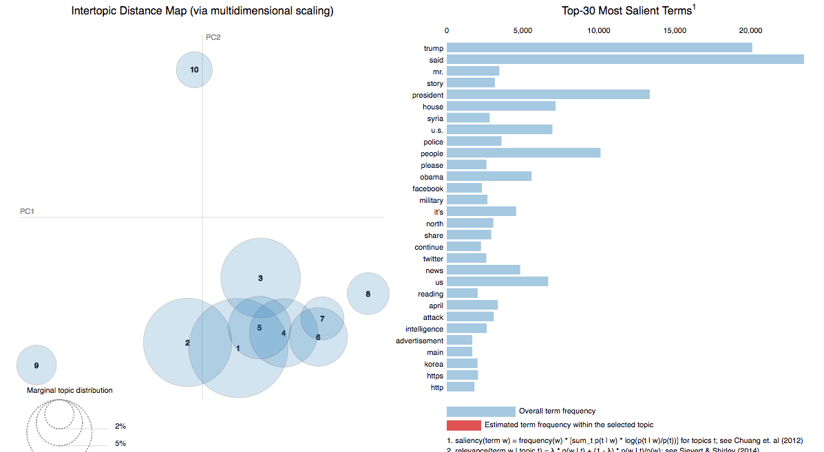
Visualizing the Corpus with Topic Mining
Applied machine learning techniques (K-means and Latent Dirichlet Allocation) to cluster articles by their similarity.
This visualization aims to visually represent the underlying topics of articles and how these topic patterns differ for
credible and non-credible articles.
Text was preprocessed using tokenization and the tf-idf algorithm. This visualization represents an analysis from a particular
point in time and does not incorporate new articles as they are added to the corpus.
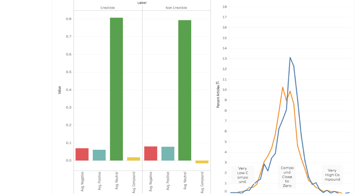
Looking at Article Sentiment
This visualization compares the sentiment analysis metrics (produced by
vaderSentiment) of credible and non-credible articles in the corpus. The bar graph shows the average percentage of positive, negative, and neutral words in the articles and
the line plot shows the distributions of compound sentiment scores (where low values represent negative sentiment and high values represent positive sentiment) for both credible
and non-credible articles in the corpus.
This visualization represents an analysis from a particular point in time and does not incorporate new articles as they are added to the corpus.